The World’s Top 12 Instagrammed Buildings

If Instagrammable wasn’t a word before, it definitely is now. Welcome to 2019! We’re always inspired by architecture and design (obviously) and we could go on and on about the world’s best cathedrals, museums, retail spaces, the importance of durable paint and scrub ratings … but what *really* matters today is if a project is Instagram-worthy, right? If your building isn’t a popular backdrop on the ‘gram, does it even exist?

This is a little extreme, but just roll with us on this.

Check out the Top 12 Instagrammable Buildings below.

12 Sagrada Família

11 The Acropolis

10 Taj Mahal

Follow us around the world ?? PHOTOGRAPHER @doyoutravel wiith beautiful model @taramilktea July 17,  2017 LOCATION #Tajmahal CHOSEN BY@boyephotografy REF TAG #Best_worldplaces Thank you for following @best_worldplaces ?? Visit our family and friends galleries for more beauty @BEST_ITALIANSITES @BEST_AMALFICOAST @BEST_EARTHSCAPES @igworld_global @bestofnetherlands @ok_spain @bestgermanypics_ @wu_greece @worldprime @infinity_hdr #worldprime #vip_world_photo #Traveldrops  #ok_spain #bestcitybreaks #ig_world_colors #europe_vacations #igworld_global #travel #travellife #travels #vacations #traveldiaries #travelblog #travelphotography #pictureoftheday #l4l #like4like #traveltheworld #tv_travel #BeutifulDestinations  #wonderful_places #depthsofearth #igexquisite #pocket_world #bestcapturesglobal #monumental_world #BestVacations

A post shared by WORLDPLACES ?? FOR YOU (@best_worldplaces) on

9 Empire State Building

Hanging out of a helicopter over the Empire State Building! TRAVEL GOALS! #seizetheholiday

A post shared by evanedinger (@evanedinger) on

#EmpireState ?

A post shared by World Tour Viagens Campina G. (@worldtourpb) on

8 The Colosseum

7 Burj Khalifa

Downtown Dubai #burjkhalifa ?:@sebastian_t1000

A post shared by Dubai (@dubai) on

Good Night Dubai..!! Pic by: @roaparcero #burjkhalifa #visitdubai #mydubai #lovedubai #dubaiview #dubaitag #dubai

A post shared by Dubai DXB U.A.E ???? (@dubai_dxb.uae) on

6 Notre Dame Cathedral

Au Revoir to Paris, if I stay longer I’ll fall more in love and never leave ✨

A post shared by Alyssa Blackman (@alyssabeeee) on

5 Big Ben

LAST STOP: London. ? #London #BigBen #England

A post shared by Shelby Mazon (@shelbeezzyy) on

4 Disneyworld / Cinderella’s Castle

3 The Louvre

By the Louvre ?

A post shared by Diana Dazzling (@dianadazzling) on

2 The Eiffel Tower

1 Disneyland / Sleeping Beauty’s Castle

My fav place ever ??☀️??? #Disneyland #disneycaliforniaadventure

A post shared by Alexandra Mexon ? (@alimexon) on

How Can Any Piece of Architecture and Design Compare?

It’s pretty hard to compete with the likes of the Eiffel Tower and the Colosseum, but we can all aspire to create something worthy of the ‘gram.

It’s impossible to design a building today with as much historical importance as the Acropolis, but you can design beautiful interior spaces meant to last and watch as they become insta-famous. Sketch London is one of my favorite examples of this.

Sketch’s Gallery room is a hotspot on Instagram due to it’s beautiful millennial pink interior. With lush velvet pink seating and a splash of pink paint as a backdrop to the plethora of artwork hanging on the walls (it’s not called the gallery without reason), it’s easy to see why this makes a popular backdrop for all the insta-famous fashion bloggers, models and travelers alike.

Maybe you’re not going to create the next Colosseum (we hope not, anyway) but you can make yourself a beautiful insta-worthy interior with some beautiful accent lighting, statement making paint and lush seating.

ScrubTough Max: Overachieving Paint for High Traffic Areas

New Product Announcement

ScrubTough Max specialty paint perfect for high traffic areas

ScrubTough Max

Scuffmaster’s newest product ScrubTough Max is the strong and dependable partner that can handle the rough and tumble action. This durable specialty paint looks great and holds up to high traffic wear and tear!

The Answer For High Traffic Areas

ScrubTough Max specialty paint perfect for high traffic areas

High traffic areas need an extra durable paint that can handle the daily wear and tear that’s also washable so you’re not constantly having to repaint and repair! We’ve all been there. ScrubTough Max is the solution to that sticky situation, being an extra durable specialty paint that simply looks like a regular semi-gloss paint.

Out Of This World Scrub Ratings

ScrubTough Max specialty paint perfect for high traffic areas

Unfortunately for other paints, ScrubTough Max is 20 times more scrub resistant than residential paints, and has a scrub rating of over 12,000! We’ve gone into great detail on the importance of scrub ratings when considering the paint for your space. Of course, the higher the scrub rating, the better – this will increase your ROI and make sure you paint lasts and protects your walls for years to come, even in those tricky high traffic areas. You can read more about scrub ratings right here.

Environmentally Friendly Specialty Paint

ScrubTough Max is a low VOC (you can read more on VOC’s here!) water-based paint with an advanced polyurethane formula. This makes application smooth and easy AND helps save the environment.

Infinite Colors

Of course with Scuffmaster there’s endless color possibilities, and with ScrubTough Max there really are an infinite amount of colors possible (at no extra charge!).

Brush, Roll or Spray All Day

ScrubTough Max specialty paint perfect for high traffic areas

Find out more about this durable semi-gloss specialty paint and request free samples right here. Looking for something specific? Any color is possible with ScrubTough Max, just contact our customer service team and we’ll be able to create the perfect color for any project.

High Traffic Guide

Not sure if your project needs a durable specialty paint with high scrubs? It can be hard to weigh the options and determine which paint is best for all situations. Download our guide on picking paint based on scrub ratings right here.

Get Your Scrub Rating Guide

15 of The World’s Most Colorful Buildings

The World’s Most Colorful Buildings

Just in time for summer, we thought we’d share some colorful inspiration for you as you work on your architecture and design projects in your busiest months. Being a specialty paint company with literally thousands of colors in our warehouse, we LOVE color, so it seemed only natural that we would spend a day finding some of the world’s most colorful buildings.

This was so much fun.

Scroll through to see our favorite 15 of the world’s most colorful buildings!

21 Cake Headquarters

Beijing -2012 // People’s Architecture Office

Located in Beijing the design for the 21 Cake headquarters relied on the use of the three primary colors: red, yellow and blue. People’s Architecture Office designed the headquarters of the gourmet cake franchise to have primary colored glass panels layer to create a spectrum of changing colors.  You can read more on this awesome project right here.

Seguin Apartment Building

Boulogne-Billancourt, France // Agence Bernard Bühler

This apartment building in France designed by Agence Bernard Bühler features beautiful colored balconies. It was designed with an urban style with volumetric angles and terraces of various colored glass creating a playful exterior. The bright colored balconies contrast nicely with the deep warm grey used on the rest of the exterior. You can see more here.

Didden Village

Rotterdam, Netherlands – 2006 // MVRDV

Built for the Didden family on top of an existing monumental house this was designed as an extension to create extra space for their family. The Dutch architecture firm MVRDV created this is an example of the growing trend to use urban roofscapes for new living and working spaces. Apart from it’s obvious eye-catching-all-blue-everything exterior, this house is very neat in it’s use of space. Bedrooms are positioned as separate houses so as to optimize the privacy for all family members (and here I had to share a room with my sister). I wonder what the neighbors think of MVRDV’s choice of color, though (I love it). You can read more about it right here.

Juzcar Malaga

Juzcar, Serrania de Ronda, Spain – 2011

The world’s first “smurf town” popped up in 2011 to celebrate the opening of The Smurfs movie. This small village in the scenic Valle del Genal was a weekend destination for hiking, climbing and ravining, but now attracts a larger number of tourists keen to see the famous blue village. Every building in this village from the houses, to the cemetery and church were all painted bright blue to embrace the premiere of The Smurfs 3D, launched by Sony Pictures. After the event had passed the residents of Juzcar decided to keep their buildings painted blue to take advantage of the unique advantage it brought to attract tourists to their village! You can read more about this one of a kind village right here.

Kuggen Building

Lindholmsplatsen, Sweden – 2011 // Wingårdh Arkitektkontor

This beautiful cylindrical building is situated in the middle of a town square. This design offers many unique features, having roots in Italian Renaissance whilst exploring an urban planning motif, featuring triangular windows and a rotating screen shade on the top floors. The architects on this job were also environmentally conscious; equipping the building with motion activated lighting and ventilation systems to save energy. You can see more of this project via ArchDaily here.

Mattel Shanghai

Shanghai, China – 2009 // Slade Architecture

Although Mattel’s massive 35,000 square foot Barbie flagship store in Shanghai closed its doors in 2011, we still wanted to include the design on this list. This three-story store featured a cafe, fashion stage, a spiral staircase lined with displays of Barbies in fuchsia pink outfits, a design center and so much more. The design expressed Barbie as a global lifestyle brand with its link to fashion, and targeted mid-20’s Chinese women. Slade played with the reality vs. fantasy of the store by playing with scale differences between dolls, girls and women, incorporating plenty of pink, and creating a feeling of youth and optimism. The pink escalator is easily my favorite part. See more on Slade’s design here.

Cathedral of Brasília

Brasília, Brazil – 1960 // Oscar Niemeyer

This incredibly unique church designed for Brasília by Oscar Niemeyer in 1960 was meant to make a powerful expression. The structure features 16 concrete columns reaching up towards the sky to represent two hands. Almost 22,000 square feet of stained glass work by Marianne Peretti replaced the clear glass filling negative space between the pillars, creating an incredible blue and green swirl pattern visible on both the interior and exterior of the church. You can see more on this cathedral here.

Palais des Congres

Montréal, Canada – “new” Palais, executed between 1999-2002 // Tétreault, Parent, Languedoc et associés, Saia et Barbarese Architectes, Dupuis, Dubuc et associés

The Palais des Congres in Montréal has a long history, with the original building constructed in 1970 designed by architect Mario Saia. When the Palais was expanded in 1999-2002 the architects included concepts spawning three centuries of design features, including this beautiful multicolored façade. This eye catching colorful façade is made of 332 colored glass panels and 58 transparent panels, making different kaleidoscopic patterns across the interior throughout the day. Check out more on the Palais des Congres right here.

Civic Center Parking

Santa Monica, California // Moore Ruble Yudell Architects & Planners

Did you expect to see a parking structure on this list? I sure didn’t expect to stumble across such a beautiful and colorful parking garage when researching colorful buildings! This parking ramp in Santa Monica for the Civic Center was designed by Moore Ruble Yudell architects and planners and is one of the first LEED certified parking structures in the United States. The series of bays are made of colored glass that bring an ever-changing quality throughout the day, only to be illuminated by night to create vivid color. You can find more on this parking structure here.

Neal’s Yard

Covent Garden, London

In a small alley hidden away in London’s Covent Garden, Neal’s Yard is a colorful little sanctuary in the city. This collection of shops and cafes features brightly colored buildings, windows, shop signs and decorations that give the place a very optimistic feeling. How cute! You can read a little more about it here, or just visit for yourself!

Pacific Design Center

West Hollywood, California – 2011 // Pelli Clarke Pelli Architects

This new addition to the Pacific Design Center in West Hollywood was constructed in 2011 and designed by Pelli Clarke Pelli Architects. Known as the Red Building it joins both the Blue Building and Green Building completed in 1975 and 1988, respectively. These buildings are located on a 14 acre site that houses showrooms, office space, a film theater, conference center, and public outdoor space. See more on this complex here.

Pantone Hotel

Brussels, Belgium // Olivier Hannaert and Michel Penneman

This seven floor Hotel in Brussels was designed for color giant Pantone and features a different color palette per floor. Filling Pinterest boards the Pantone Hotel is designed to be a work of art in itself, inspiring guests with vibrant design and decor set against white walls, furniture and bedding. Read more about this project here.

Your Rainbow Panorama

Aarhus, Denmark – 2011 // Studio Olafur Eliasson

My favorite feature in this collection of world’s most colorful buildings is this Rainbow Panorama in Denmark. It is incredible the way color can change our perception of things, and in this case, the city of Aarhus. As you walk through this circular panorama the views subtly transform as the color seamlessly changes, creating completely different atmospheres and perceptions. Read more on this project here.

Saguaro Hotel

Palm Springs, California – 2012 // Stamberg Aferiat Architecture

This bright and colorful hotel conversion of an old Holiday Inn that was originally build in 1977 is situated in Palm Springs and looks absolutely refreshing. The beautiful colors don’t stop on the outside, either, as the interiors of the rooms are also quite vibrant. Stamberg Aferiat Architecture designed this 245 room hotel and included 7,500 sq. ft. of meeting space, a pool, two whirlpools, a spa, fitness center, restaurant and two bars. Bonus? It’s also pet friendly. See more here.

Saint Basil’s Cathedral

Moscow, Russia – 1555-1560 // Postnik Yakovlev, Ivan Barma

In stark contrast to the rest of the world’s most colorful buildings featured on this list, Saint Basil’s is far from modern, having been constructed between 1550-1560 by Ivan The Terrible. Saint Basil’s was constructed to commemorate Ivan’s conquest of the Islamic city of Kazan. An extraordinary structure that features eight chapels and ornate onion domes, St. Basil’s is the most recognizable building used to symbolize Russia. The colorful and ornate exterior is unlike any other, with strong pigments covering the exterior and carrying into the interior. Read about the cathedral here.

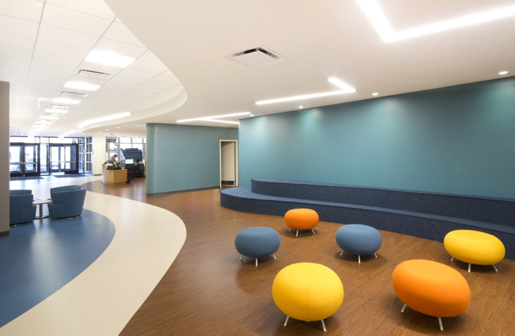
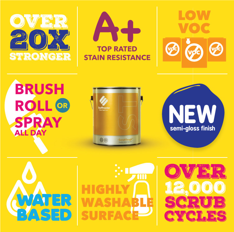
How To Get Your Own Colorful Building

We could stare at this collection of the world’s most colorful buildings all day long, but realistically it’s the interior of buildings that’s our strong suit. Scuffmaster’s specialty paint offers tons of colorful and vibrant options for your interior designs, from bold eggshells to stunning metallics and the world’s toughest paint. Find some color for your very own colorful building right here.

Environmentally Friendly Paint: Exploring The Environmental Impact Of Paint Part 3

Environmentally Friendly Paint

using environmentally friendly paint means avoiding removal and disposal

Saving The Earth Part 3

By now you and Mother Earth should be BFFs. You’ve already read (TWICE) about how to save the world with your design projects, and how environmentally friendly paint can play a part! You can read Saving The Earth Part 1 here, and Saving The Earth Part 2 here. Unfortunately STEP3 is the part that no designer wants to think about… the eventual destruction of all your hard work. What happens to all of those products?

Removal and Disposal

wallcovering and other materials fill up landfills

What happens to all that gorgeous wallcovering that you paid $3 a square foot for? Or all that beautiful tile that you made absolutely sure the contractor installed it JUST the way you wanted it? We know, sometimes those materials are required and you have to use them, but make sure you consider the eventual outcome of said products before you put the final spec in for them.

environmentally friendly paint has little to no waste

On the other hand, paint has VERY little waste. Waterbased paint (made with water…) isn’t harmful to the environment and can be easily recycled into new paint without creating waste. You don’t have to spend time and money chipping old paint off your walls (can you even imagine doing such a thing?) to send to a landfill, you just paint over it! Could it get any easier?

Where Are We Going With This?

many products end up in landfills

What are you actively doing to make sure your designs aren’t creating waste and adding to landfills? If you’re not considering this, just picture all of your products used on your project headed to a landfill (harsh, but you get the idea). All of that hard work ends up significantly harming the environment if it’s all just going to be thrown away in a matter of years for a remodel or design update.

We don’t mean to be harsh or lecture… but it’s an important thing to consider when working on a new project. If you can’t avoid it, simply move on and try to help out the environment in other ways!

Designing With Mother Earth In Mind

Starting new projects can be overwhelming and today you have an almost unlimited amount of products you can choose from. We know how stressful it can be to find the perfect products for all of your spaces. However, we can’t stress enough the importance of designing with the environment in mind. With LEED credits on the line, today’s new designs are already greener than ever, but that doesn’t mean we can’t work even harder to protect this planet. Environmentally friendly paint can do a lot to help projects stay on budget, look fantastic, update old surfaces, and put a smile on Mother Earth’s face.

Environmentally Friendly Paint: Exploring The Environmental Impact Of Paint Part 2

Environmentally Friendly Paint

environmentally friendly paint is versatile

Saving The Earth Part 2

In our last post about the importance of environmentally friendly paint we talked about how sustainability plays a role in saving the earth (and your projects). It’s a slippery slope with VOC content and sustainability, so make sure you’re up to speed. You can read our last post here, and more about VOC content here.

So what’s next? You already chose products that are environmentally friendly because you love the earth, what more do you have to do? It’s time to think about the future removal and/or versatility of the products you choose for your jobs.

Versatility

environmentally friendly paint is versatile

As styles and occupants change, painted surfaces are one of the easiest to update. Many products you could choose (tile, wallpaper, etc) require costly removal. Paint does not. There’s no need for removal (often hazardous for the environment) and there’s nothing to add to the landfills (score 3 for Mother Earth!). Simply choose a new paint and color and apply it over the previous coat. More often than not all that is required to repaint a space is light sanding and priming!

In situations where removing old tile, block or other built-ins is not an option, there are specialty coatings that can quickly modernize these surfaces without requiring their removal and disposal (score another for our Mother). Not only is this solution the best for the environment but it is also great news for your design budget and project timeline!

It’s amazing what a little paint can do to completely transform and update a space. Environmentally friendly paint is the most versatile product you can specify for your jobs.

Designing With Mother Earth In Mind

Starting new projects can be overwhelming and today you have an almost unlimited amount of products you can choose from. We know how stressful it can be to find the perfect products for all of your spaces. However, we can’t stress enough the importance of designing with the environment in mind. With LEED credits on the line, today’s new designs are already greener than ever, but that doesn’t mean we can’t work even harder to protect this planet. Environmentally friendly paint can do a lot to help projects stay on budget, look fantastic, update old surfaces, and put a smile on Mother Earth’s face.

Environmentally Friendly Paint: Exploring The Environmental Impact Of Paint

Environmentally Friendly Paint

Scuffmaster's environmentally friendly paint


Here at Scuffmaster we understand that no matter how pretty the color is or how unique the look might be, if the product isn’t also environmentally friendly, it doesn’t stand a chance in today’s marketplace. If you follow our products, you already know a few of the things we do to ensure that we’re one of the most environmentally friendly paints on the market. As manufacturers, it’s our duty to set a high standard and be great stewards of our environment. That’s why we jumped at the chance to put a humongous solar array on the roof of our Eagan Minnesota headquarters. We like to say there’s a little bit of sunshine in every gallon of environmentally friendly paint we produce.

Saving The Earth Part 1 (One Gallon At A Time)

Scuffmaster's environmentally friendly paint manufactured with solar energy
Solar panels on our rooftop used to manufacture our products

However, there’s more to saving the Earth than paint with renewable energy. Our products have always been water based (score 1 for Mother Earth). We officially use zero VOC colorants in all of our paints. (Mother Earth is up by two!) and we’ve continually pushed to lower the VOC level of our products while maintaining their durability.

Sustainability

durability and VOC levels all affect the sustainability of environmentally friendly paint

Maintaining the ideal balance between enough VOC content in our paint to make it perform well while simultaneously not harming the environment can be a tricky one. The more VOCs–the worse it is for the environment. But…increasing the amount of VOC in paint also increases the durability of the paint, which ultimately means fewer repaints, less manufacturing, less shipping, less travel, and less packaging– it’s a delicate balancing act. You can read more about VOCs here.

We love our products, but that’s not what we’re here to talk about. While choosing product for your projects you may want to consider the environmental impact of your job. What are the most sustainable products you can use? Our customers know that specifying durable, sustainable products add value to their work and to their industry as a whole. We strive to make our products the obvious choice for anyone seeking a truly environmental solution for interior coatings that last.

Where Are We Going With This?

paint is the most sustainable and environmentally friendly product you can use

Simply put, paint is one of the most sustainable products you can choose and therefore the most environmentally friendly. (That’s where we were going, thanks for hangin’ in there.)

That means you need to make sure that the products you’re specifying are durable and will last as long as the lifecycle of your space you’re designing is expected to last. Remember, the absolutely lowest VOC content does not mean the most environmentally friendly paint, it could mean the exact opposite if it’s not also durable.

Designing With Mother Earth In Mind

Starting new projects can be overwhelming and today you have an almost unlimited amount of products you can choose from. We know how stressful it can be to find the perfect products for all of your spaces. However, we can’t stress enough the importance of designing with the environment in mind. With LEED credits on the line, today’s new designs are already greener than ever, but that doesn’t mean we can’t work even harder to protect this planet. Environmentally friendly paint can do a lot to help projects stay on budget, look fantastic, update old surfaces, and put a smile on Mother Earth’s face.

Professional Painting Equipment: How The Right Tools Affect You

Which professional painting equipment is right for your job?

Professional Painting Equipment 101

If you’re a pro and have been a pro for years, you know first hand the affect that the right professional painting equipment can have on the job. Your painting equipment has the power to make or break the final design of a space. No matter how much money you spend or save on that paint, it all comes down to the application.

Download our equipment guide for a more in depth break down of each of these application methods.

You can take your time and follow the install instructions to the T, but if your painters are ill-equipped with the wrong equipment you can say buh-bye to all that hard work and start over.

First and foremost: when you land the bid for the next hot project with a specialty paint spec, check with the manufacturer on what equipment is needed for the job. They will be able to provide all the necessary information to you so you and your painters can ace that installation. Many times they’ll also be able to locate a provider of this equipment should your team not already have it on hand.

What Equipment Is Necessary?

HVLP, airless and conventional… sounds like a bunch of mumbo jumbo if you’re not a painter, but since you’ve been around awhile this is pretty much painting 101 to you. Specialty finishes have been developed and tested an immeasurable amount of times by their manufacturers, so be sure to follow the equipment suggestions from the manufacturer to achieve the desired aesthetic. Ultimately, the manufacturer is going to know what equipment achieves the correct and intended look. We’ve seen time and time again installers use the equipment not recommended and then have to deal with unhappy clients, and ultimately end up re-applying the product all over again.

Professional Painting Equipment

Brushes And Rollers

Let’s start with the easy equipment: brushes and rollers. Pretty much everybody has painted with brushes and rollers and is familiar with them. They are the most simple, least disruptive and most cost effective form of application. Make sure you use the right brush for the right paint and surface you are painting. When it comes to roller covers you are going to want to make sure you get the roller with the right nap for the job.

Spray Equipment

Spray equipment is where painting equipment can get confusing. You have  Conventional, HVLP, Hybrid, Airless and Electrostatic all in your arsenal. Let’s make sure you know which ones are best for which jobs.

Conventional setup offers maximum control over the look of the finished product. It’s low capacity makes it a setup better for smaller jobs.

HVLP (High Volume Low Pressure) is very versatile and portable, making it ideal for small and tight spaces.

The Hybrid setup offers a high degree of control that’s suitable for applying a wide variety of products.

The most commonly used spray method, no surprise, is the Airless setup. Preferred by painters as a fast and economical installation method, it also creates very little overspray. This is best for large jobs that don’t require a ton of precision.

Electrostatic application produces little to no over-spray or lost product, this is better for OEM paint jobs that are difficult (such as wrought iron or other fencing).

Download our equipment guide for a more in depth break down of each of these application methods.

Where Do I Get Painting Equipment For Your Finishes?

Which professional painting equipment is right for your job?

Not sure where to get the right professional painting equipment? Not sure what painting equipment you need?

Easy – once again, just check the finish application guides or give the manufacturer’s customer service team a call. If they don’t know, something is very very wrong and you probably shouldn’t be using their products. We really recommend Binks equipment and you can usually find it here.

Most of Scuffmaster’s finishes use conventional, airless or simply a roller for application. Follow our guides and make sure you have the right professional painting equipment and everything will go over smoothly – your finished product will be B-E-A-utiful.

Download our equipment guide for a more in depth break down of each of these application methods.


Professional Painting Equipment Guide Download

Color Of The Month: Passionate Pink

October’s Color Of The Month: Passionate Pink

October Color Of The Month: Passionate Pink

October is Breast Cancer Awareness month, so it’s only natural that we’d pick this passionate pink as our Color Of The Month. As an added bonus, this beautiful pink is also a trending color for Fall 2018.

Scuffmaster's Color Of The Month: Passionate Pink

A feminine and compassionate color, this pink can bring warmth and a sense of safety to your designs.

Associated with Breast Cancer, Pink is a color of hope, compassion, love and understanding, nurturing, romance, and femininity. Pink suggests safety and vulnerability. It can be sweet and playful, and cute and romantic, but with the rise of Millennial Pink over the last several years and the insurgence of popularity of using pink in our interior design world, the use of pink as a neutral has blossomed. In interior design, pink has a calming effect on emotional energies.

Take this pink into your designs with any of our textured or metallic finishes. Check out some of our pink samples right here (with many more in our library)!

Scrub Cycles: What You Need To Know

What you need to know about scrub cycles

They’re Actually Important

There are a number of things you need to know when you start to work on a new paint project. Your paint’s scrub rating is one of them, and it matters in nearly every situation. There are a lot of misconceptions around scrub cycles and what ingredients are in your paint products.

Download our guide to choosing the right paint product here!

Scrub cycles are based on the American Society for Testing and Materials ASTM D2486 test. This is the agreed upon scrub test in the paint industry. What this scrub rating number means is how many times your paint can be scrubbed before reaching failure (paint coming off the wall with cleaning, etc.).

To do this test a machine scrubs the surface with a brush and an abrasive compound repeatedly and keeps count of how many times the product is scrubbed before failure. It’s pretty boring, but it’s pretty important too.


Scrub cycles are an important factor in choosing the right paint for your project

How They Affect You

What this means to you: the higher the scrub rating of your chosen paint product, the longer it’s lifespan on your walls. If you have a high traffic area, you’re going to want to make sure that product you’re using has a high scrub rating or you can guarantee you’ll be re-painting shortly. Figure out what the lifespan of the project is (or what your client expects in the future) before making a final paint decision. You’ll want to make sure the scrub rating reflects the expectations so nobody is surprised down the road. If you’re going to be applying the product, make sure you buy what was specified instead of flipping it out for something cheaper. It really does matter in the long run.

What Do VOC’s Have To Do With This?

Have you been wondering if VOC’s have anything to do with this? No? Just us? Well, not surprisingly, VOC content does play a role in scrub ratings. Lowering the number of VOCs in your paint products often means lowering your scrub rating. Taking that many ingredients out can weaken the integrity of the paint’s surface. Low VOC’s are great, but weakening the paint ultimately means re-painting and releasing more VOC’s and creating a vicious cycle. Make sure you know which is more important for each job.


Pick the right paint product for your scrub rating needs

How To Choose The Right Product

You’ll have to figure out on a case per case basis what product you need based on scrub cycles. If it’s a low traffic area, you can certainly get away with a low VOC and low scrub rating paint. Steady to high traffic areas will need something a little tougher that can hold up the wear and tear and last for your space’s entire lifespan. Make sure you have a conversation with the client and don’t flip the spec.

Download our guide to choosing the right paint product here

Get Your Scrub Rating Guide

Color Of The Month: Sapphire

September’s Color Of The Month: Sapphire

Color Of The Month: Sapphire

September’s birthstone and Scuffmaster’s Color Of The Month, Sapphire, is not only perfect for your fall palettes with its deep, rich hue, but is known to ward off evil and symbolize wisdom and purity. Use it wisely in your interior designs!

Color Of The Month: Sapphire

Representing wisdom and purity, Sapphire is one of the 4 precious gemstones. This “Holy Stone” is also associated with royalty and wealth. Those associated with this birthstone are said to be practical, thoughtful and hardworking.

Sometimes compared to Lapis Lazuli, Sapphire is known to evoke the power of the deeply mysterious with its rich blue color. It’s said that the sapphire has the brilliance and clarity of depth that extends its illumination down into the soul of anyone who studies it.

Thinking about using Sapphire in your interior designs? Sapphire evokes many properties, including: protecting from negative energies, attracting financial abundance (paint your office this sapphire blue!), promotes mental clarity, evokes feelings of devotion, strengthens integrity and intuition, can clear depression, helps eyesight and bestows wisdom.